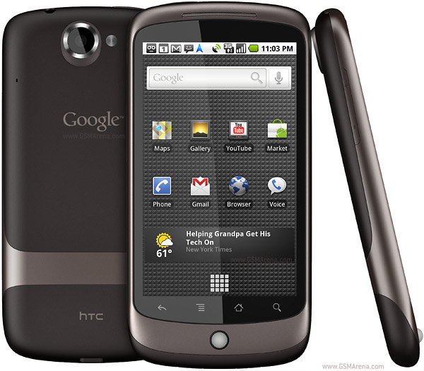
NexusOne: AppBrain.com — what the android market web interface should have been like all along!

I found this interesting site from the This Week in Google show. It’s what the Android Market should have been designed like in the first place.
With an regular android phone, there is an app called Market through which you can browse, install free apps and buy paid apps. All the interaction occurs on the phone, and there is no need to “sync” from a “master pc” (e.g. itunes) or anything like that. Most of the time you end up discovering the app elsewhere (blog, friends, ad) and calling the app up in the market and installing it. Unless you know what to search for, browsing through a thousands of apps on a 3-4″ display sucks.
(Note: I have to point out, some people have it worse than that. In certain countries, Malaysia included, you can’t buy paid apps, unless you root your phone (almost everyone ends up doing this) or temporarily install a foreign SIM. In some countries, Malaysia included, android phones from certain distributors don’t even come with the Market software, which severely limits what you can install in it unless you replace the firmware with a more “proper” or rooted image).
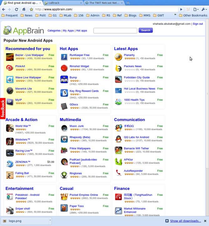
Well the site that I discovered, AppBrain.com lets you do all that in a much nicer environment … the web. Instead of the tiny phone display, I now have my full 24″ screen to browse apps.
You can browse the available apps under individual categories, or do a search. In addition to what you can see on the phone, it also:
-
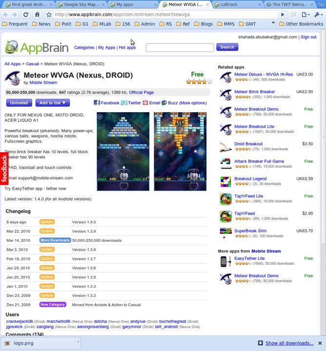
- Gives you a changelog, so you can see when which version of the app was released. This is useful to gauge whether an app is still being updated or stable/dormant
-
- Ability to share the apps’s info on facebook, twitter, email or buzz
-
- Other apps that AppBrain feels is related to this app. Useful when you find an app that does almost what you want it to do, but want to look at some other alternatives too
-
- Other apps from the same author
Well … yeah, there are other sites like this before, right? http://www.cyrket.com was one of the first ones, and http://apps.doubletwist.com has a pretty interface too. But where AppBrain outdoes these! How?
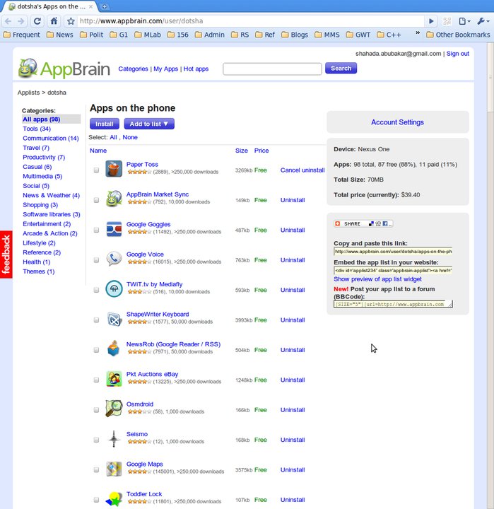
If you register as a user on appbrain.com, and install the sync client on your phone, appbrain.com lets you manage what apps are on your phone through the web interface on your PC. You can see the list of apps on your phone on the appbrain website. The neat thing is that you can filter the list by categories … so it’s not one long boring list like on the phone. I didn’t even know I have an app under “Health” category installed.
If you want to uninstall something, simply click uninstall and that app will be marked for uninstall the next time the appbrain app on the phone does a sync. This is something that takes quite a few taps to do on the phone itself so is a really useful feature.
It works both ways too … If you’re browsing a new app, click “install” and the sync client will install it on your phone. Essentially, it acts like a UI to the android market, on your PC. And because it works “through the cloud”, you aren’t tied down to a single PC to sync with. Heck, you don’t even need to have your phone near your PC to manage the apps on it.
AppBrain also lets you publish your list of apps so others can see. This is one way to discover new apps — browse through the lists of apps your friends or others have put up, and you may see something interesting.
My app list is now at http://www.appbrain.com/user/dotsha.
Some other app lists from the TWiG Team:
- http://www.appbrain.com/user/leolaporte/apps-on-the-phone
- http://www.appbrain.com/user/ginatrapani/apps-on-the-phone
If you don’t want to make your list public, you can also set it to private and specify who you want to share it out to.
Some interesting statistics:
- Device: Nexus One (last sync 30 min ago)
- Apps: 98 total, 87 free (88%), 11 paid (11%)
- Total Size: 70MB
- Total price (currently): $39.40
This is how the google market UI should have been designed in the first place. Heck, this is how all app markets should be designed … a minimal app on the phone, and a smarter, friendlier app that sits in the cloud.
I’d like to see it make more use of social links to recommend and suggest apps. Also it’s important to note that AppBrain sits on top of the basic android market app on your phone, so if you don’t have access to paid apps or don’t have android market, then this won’t work for you (but then you’ve probably already rooted your phone if that was the case).
If you’re on Android … come share your app list!


This post was originally published as a Facebook Note at 2010-04-21 00:59:50 +0800.


